
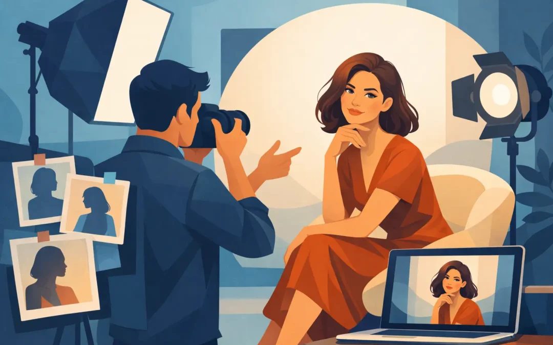
A portrait can be technically perfect and still say very little. The light may be flattering, the subject recognizable, the retouching immaculate. Yet without a point of view, it becomes interchangeable. Art directed portrait photography begins before the camera is raised. It gives a face, a setting, and a moment a reason to exist together.
For editorial teams, publicists, and creative directors, that difference is practical as well as aesthetic. A considered portrait can carry a feature package, establish the atmosphere of a campaign, or give an artist a visual identity that feels specific rather than managed. The goal is not decoration. It is an image with enough clarity to remain in the mind after the page has turned.
What Art Direction Changes in a Portrait
Art direction is the discipline of deciding what the image is trying to communicate, then aligning every visible choice with that intention. It considers location, palette, styling, grooming, casting, gesture, set elements, framing, and the relationship between subject and camera. Some decisions are made weeks ahead. Others happen in the small adjustments that transform a set once the subject arrives.
This does not mean every portrait requires an elaborate build. A white wall, a single chair, or an unadorned room can be the right setting. Restraint is often more revealing than production. The question is whether the spareness is deliberate and whether it serves the person being photographed.
A musician photographed against a blank background may need the directness of a close frame and hard light. An author in a personal workspace may need more room around them, with objects that suggest a lived intellectual world without turning the image into a catalog of references. A beauty portrait may rely on surface, color, and precision. Each approach asks the viewer to pay attention in a different way.
The strongest work does not treat art direction as a layer applied over personality. It creates conditions in which personality can register more distinctly.
Art Directed Portrait Photography Is a Collaboration
A useful creative brief provides a direction, not a cage. It identifies the editorial context, intended audience, deliverables, visual references, practical limits, and what must be avoided. It should also make room for the unexpected. A portrait session becomes flat when everyone is trying to reproduce a reference frame by frame.
For a public figure, the balance can be particularly delicate. The image needs to support a publication, release, or campaign while allowing the subject to remain legible as a person. A publicist may need efficiency and confidence. A talent representative may be attentive to presentation. The subject may arrive with a sharp sense of what they do not want. These are not obstacles to authorship. They are part of the work.
The photographer’s role is to turn competing needs into a coherent visual language. That requires preparation, but it also requires attention in the room. A guarded subject may respond to a quieter set. Someone naturally performative may need a more active exchange. A pose that reads as controlled in person can feel inert in the frame. The direction has to remain responsive.
Good portraiture protects time for this. The first minutes of a session are not a formality before the real work begins. They are often where trust, rhythm, and the most useful visual information emerge.
The Subject Is Not a Prop
Art direction can fail when concept becomes more important than the person. Over-styling, excessive set dressing, or a reference-heavy treatment can reduce a subject to a silhouette inside someone else’s idea. The result may be visually loud but emotionally distant.
A better standard is tension rather than control. Let the visual world create pressure, contrast, or context, then leave room for the subject to complicate it. A polished dress can meet an industrial location. A formal pose can be interrupted by a private expression. A cinematic environment can contain an unvarnished face.
That friction gives a portrait life. It is also what separates a recognizable image from a merely attractive one.
Building the Image Before the Shoot
The visual decisions made before production determine how much freedom the set will have later. A clear process does not diminish spontaneity. It creates the structure that allows spontaneity to matter.
Start With the Editorial Use
An image designed for a magazine cover operates differently from a press portrait, a cultural profile, or a beauty campaign. Cover art needs usable negative space, immediate recognition at small scale, and an image that can live beside typography. A long-form feature may benefit from a wider sequence with environmental detail and tonal variation. Social crops, vertical formats, and campaign adaptations should be considered early, not salvaged after the fact.
Usage affects production choices. If a brand needs a suite of images, the concept should be built to yield range without losing its center. That may mean one location with several distinct visual zones, or a controlled set that can shift through lighting and framing. If the assignment needs one definitive frame, the production can be more concentrated.
Choose a Location With a Job to Do
Locations should contribute more than atmosphere. They can place a subject within a social world, introduce a visual counterpoint, or establish a tonal temperature. A hotel room suggests something different from a studio. A house can imply intimacy, but it can also become too literal. A street location may bring energy and contingency, though it introduces noise, weather, permitting, and less control.
Studios are sometimes treated as a neutral fallback. In fact, they are often the more exacting choice. With the distractions removed, light, posture, color, and expression have nowhere to hide. The simplicity of the frame asks more of everyone involved.
Treat Styling and Light as One Conversation
Wardrobe, hair, makeup, and lighting should not develop in separate lanes. The sheen of a fabric changes under flash. A saturated color may become dominant against a colored backdrop. Skin texture can be celebrated, softened, or sharpened through light long before retouching begins.
This is where test images are valuable. They expose problems that mood boards cannot: a silhouette that collapses in a seated pose, jewelry that catches too aggressively, a makeup finish that reads differently on camera, or a background that competes with the eyes. Small corrections at this stage save a production from relying on postproduction to solve a conceptual mismatch.
The Necessary Trade-Off Between Precision and Energy
Portrait sessions often move between two modes. One is precise: marks are set, lighting is measured, garments are adjusted, and the composition is built carefully. The other is conversational and quick: the subject shifts, the frame follows, and an unplanned gesture takes over. Both are necessary.
Too much precision can make the work feel airless. Too much looseness can leave an editorial team without the usable hero image it needs. The best approach depends on the assignment, the subject, and the visual language. A beauty story may require exacting control. A writer or actor in an environmental portrait may benefit from more movement and interruption.
The essential task is knowing when to stop refining. Once every detail is correct, the image still needs a charge. Sometimes that arrives in the moment after the pose is released.
Why a Distinct Portrait Has Long-Term Value
Commissioned images are often asked to do more than one job. They announce a project, support a profile, populate a press cycle, and later become part of a subject’s visual record. Generic photographs may satisfy an immediate need, but they rarely build recognition over time.
A considered portrait gives an organization an asset with editorial credibility. It can be cropped, paired with copy, printed large, or used alone because its central idea remains intact. It also signals discernment. When the visual language is particular, audiences understand that the person or brand has made a choice about how it wants to be seen.
That choice does not need to be loud. A spare, direct image can carry as much authority as a complex production when every element is doing its work.
For a commission, the most useful question is not simply, “What should this look like?” Ask what the finished image should make a viewer feel they have understood. The answer may be poise, intensity, strangeness, warmth, ambition, or a contradiction that cannot be reduced to one word. Give the session enough intention to find that answer, and enough space for the subject to surprise you.