
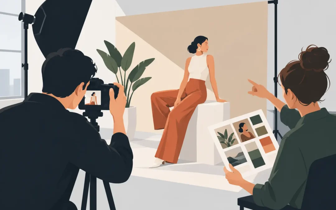
A photograph can be technically impeccable and still say very little. Art direction for photoshoots gives an assignment its internal logic: why this person, in this space, wearing these clothes, under this light, at this moment. It is the discipline that turns a collection of well-made frames into a body of images with a point of view.
For editorial teams, publicists, and creative directors, that distinction has practical value. A portrait may need to carry the atmosphere of a profile, introduce a new body of work, support a campaign, or give a public figure room to appear less managed. The visual decisions must serve that purpose without becoming louder than the subject.
What Art Direction Actually Controls
Art direction is often reduced to a mood board or a list of references. Those tools are useful, but they are not the work itself. The work is deciding what the image should communicate, then protecting that decision through every variable the camera sees.
That includes location, palette, casting, wardrobe, grooming, objects, framing, lighting, movement, and the rhythm of the final edit. It also includes absence. Removing a prop, simplifying a background, or asking talent to stop performing can be as consequential as adding a dramatic visual element.
For a campaign, the direction may need to create a consistent world across stills, motion, social crops, and print. For a magazine feature, it may need to leave room for a writer’s perspective and a publication’s design language. A portrait of an artist may call for a more open approach, where the setting and the sitter can introduce tension or surprise.
The goal is not to make every part of the frame visibly “art directed.” It is to make the image feel intentional.
Begin With the Image’s Job
Before references are gathered or a studio is booked, establish what the photographs must do. A concise creative brief should name the audience, intended use, emotional register, and required deliverables. It should also identify the one impression that cannot be lost.
A beauty story might need precision, texture, and a clean relationship to product. A talent portrait might need to communicate intelligence and ease rather than glamour alone. A lifestyle campaign may need warmth, but warmth can mean sunlit informality, a saturated interior, intimate framing, or all three. The word is not enough until the visual meaning is defined.
This early conversation is where useful constraints appear. A publicist may require options that are polished and broadly usable. An editorial team may want a less expected cover possibility. A brand may need negative space for copy. These needs do not weaken the concept. They give it a real operating frame.
Build References Around Decisions
Reference images should clarify a direction, not become a collection of borrowed surfaces. A good deck can show how light falls, how close the camera sits to the subject, how much visual information belongs in the background, and whether the images feel composed or observed.
It helps to label what each reference is doing. One image may be useful for its soft side light, another for the tension of its crop, and another for its unguarded expression. Without that distinction, a reference deck can create false agreement. Everyone may like the pictures while imagining a different shoot.
Avoid presenting an aesthetic as a fixed recipe. The most compelling work responds to the actual person, space, and day at hand. References establish a vocabulary. They should not prevent the photograph from becoming its own thing.
Set a Visual Hierarchy
Every successful frame has a hierarchy. Decide what should be read first, what should reward a second look, and what should remain quiet. In a portrait, the face may lead while an unexpected color or architectural detail adds context. In a fashion image, silhouette may lead while expression gives the image its charge.
When too many ideas compete for first place, the result can feel expensive but unfocused. This is a common risk with elaborate locations, layered styling, and ambitious set builds. More production value is not automatically more visual authority. Often, one decisive element is enough.
Art Direction for Photoshoots Happens on Set
Preparation establishes the direction. The set tests it.
A strong on-set process leaves room for discovery while maintaining a clear center. The photographer, stylist, hair and makeup team, producer, and client should understand the visual priorities before the first frame. That allows decisions to happen quickly when time changes, weather shifts, or an unexpected location detail proves more interesting than the original plan.
Light deserves particular attention because it affects more than exposure. It establishes emotional distance. Direct flash can create candor, energy, or severity. Window light can feel intimate or restrained. Hard sun may make a portrait graphic and exposed. Soft, shaped studio light can give beauty imagery a controlled clarity. None is inherently more refined than another. The choice depends on the story and on the person in front of the camera.
The same is true of camera position. A low angle can add presence but may feel overly declarative. A close crop can feel private, but it can also remove the context that makes a subject compelling. Wider frames give a location room to speak, though they require discipline in every edge of the composition.
Direct the Person, Not Just the Pose
The best portraits rarely come from a long catalog of poses. They emerge from attention, timing, and a working atmosphere that allows a subject to settle into the frame.
Some talent responds well to specific physical direction: turn slightly, lower the shoulder, hold the gaze. Others become more natural with a prompt, conversation, or a clear task. For public figures accustomed to being photographed, the challenge may be moving past familiar expressions without manufacturing spontaneity.
Art direction should create conditions for a real presence rather than impose a personality on the sitter. This is especially important when the assignment is meant to reveal a creative, performer, or cultural figure. Polish matters, but personality is the element that makes an image memorable.
Keep Styling and Set Design in Conversation
Wardrobe, grooming, and environment should work as a single visual system. If the clothing has strong volume or pattern, the set may need greater restraint. If the location is spare, texture in fabric or surface can carry more weight. Color should be considered across skin tone, garments, furniture, walls, and final output, not as an isolated swatch.
Continuity matters when the imagery will be edited as a series. It does not mean every frame needs the same setup. It means each variation should belong to the same visual language. A change in location, lens, or wardrobe can be useful when it creates progression rather than fragmentation.
Edit for Meaning, Not Coverage
The edit is where art direction becomes legible to everyone who was not on set. A contact sheet may contain many attractive frames. The final selection must create a sequence, support the intended use, and avoid repeating the same note.
Choose images for what they contribute to the whole. One frame may carry immediate impact. Another may reveal character. A third may establish place or offer a clean layout option. For an editorial package, a slightly quieter photograph can be essential if it gives the story room to breathe.
Resist the instinct to select only the most conventionally flattering images. A photograph with an unusual gesture, a moment of concentration, or a touch of ambiguity may have more staying power. That judgment depends on the subject and the brief. A beauty launch and an artist profile have different thresholds for imperfection.
Retouching should follow the same logic. It can refine color, skin, shape, and distraction without erasing texture or presence. The question is not whether retouching is visible. The question is whether it supports the image’s intended reality.
When Restraint Is the Stronger Choice
A high-concept production can be exactly right when a brand needs a new visual chapter or a feature calls for a distinct world. But restraint is not a fallback. A simple setting, deliberate light, and a closely observed subject can carry greater force than a crowded production.
The trade-off is that simple images leave nowhere to hide. Composition, expression, color, and timing must be exact. They also require confidence from the client side. Not every frame needs an obvious gesture to justify its existence.
The strongest direction is felt before it is explained. Give the image one clear idea, make room for the person inside it, and allow the final frame to hold the attention it has earned.