
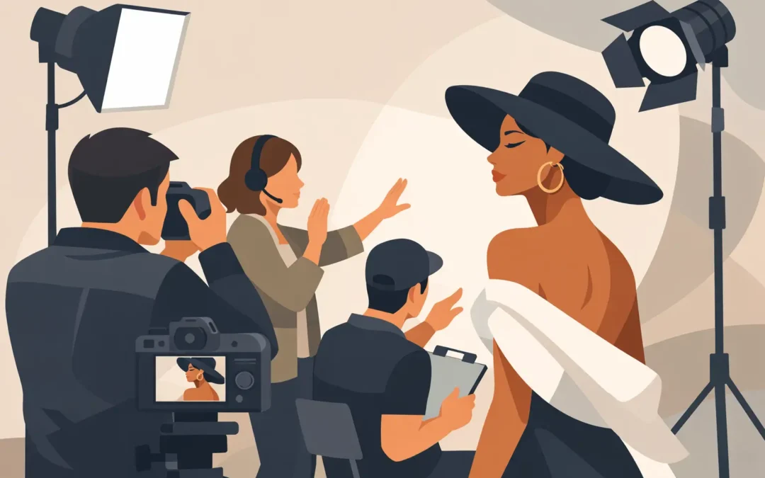
A strong fashion portrait does not begin with a look. It begins with a point of view. Fashion editorial portrait photography gives clothing a role in the image, but it asks more of the frame than proof of a garment. It needs presence, atmosphere, and a reason to keep looking.
For an editorial team, publicist, creative director, or talent representative, that distinction is practical. A portrait may need to carry a feature package, announce a new body of work, support a cover line, or establish a campaign’s visual language in a single image. The clothes matter. The person in them matters more.
What Fashion Editorial Portrait Photography Is Built to Do
Fashion photography can be product-forward, with every choice made to clarify silhouette, fabrication, and desirability. Portraiture is more interested in the individual: how a subject occupies space, withholds, performs, or meets the camera. Editorial portraiture sits in the productive tension between the two.
The result should feel composed rather than merely styled. Wardrobe can sharpen a subject’s identity, introduce contradiction, or give a story its period and temperature. A severe coat on an unguarded sitter, a delicate dress against industrial architecture, or a sharply tailored look in hard daylight can each shift the meaning of a face.
That is why the strongest images do not treat fashion as decoration. They use it as visual language. A subject may be known for music, film, art, writing, or a public persona, but the portrait can offer another register: private, theatrical, polished, difficult, playful, or unexpectedly still.
The Editorial Question Comes Before the Mood Board
References are useful, but a mood board is not a concept. It can establish a shared vocabulary for color, location, proportion, and light, yet it cannot decide what the portrait is actually saying. Before the team discusses lenses or set design, it helps to ask one clear question: what should this subject reveal here that they have not revealed elsewhere?
The answer does not need to be literal. A magazine profile may want to show an actor at a moment of reinvention. A beauty story may need intimacy without softness. A brand may want cultural authority without the familiar polish of advertising. Each call requires a different balance of control and spontaneity.
A useful editorial concept leaves room for the sitter. Over-direction can make a person look like a prop in a visual system. Under-direction can lead to attractive but anonymous frames. The work is to build enough structure that the image has intention, then leave enough air for a real response.
For public figures in particular, this balance is central. They are often fluent in being photographed and alert to the machinery around the shoot. A photographer’s preparation should create confidence, not rigidity. When the subject understands the visual premise and feels the set is being led with precision, they can spend less energy managing the moment.
Light Should Describe More Than a Face
In editorial portraiture, lighting is not only about flattering the subject. It determines distance. Diffused window light can feel observational and close; direct flash can introduce friction, glamour, or a deliberate sense of artifice. A controlled studio setup may make the clothes feel architectural. Available light can let a location carry more of the narrative.
There is no universal preference for soft light over hard light, or film over digital. Those choices depend on the subject, the publication, the wardrobe, and the intended use of the image. A beauty feature may call for exacting skin detail and a refined tonal range. A profile of an artist may benefit from grain, shadow, and a less resolved edge.
The question is whether the lighting helps the viewer understand the world of the photograph. If it is beautiful but interchangeable, it has not done enough.
Color operates in much the same way. A narrow palette can give a story discipline, especially when garments, background, and prop choices might otherwise compete. But restraint should not become neutrality by default. A saturated backdrop, a difficult green, or an unexpected clash can be the element that makes an editorial page feel authored rather than branded.
Composition Creates Status, Tension, and Access
A close portrait offers access, but not always intimacy. A subject can fill the frame and remain inscrutable. A wider frame can create distance, yet make the viewer feel invited into a complete environment. Composition determines what information is withheld and what is allowed to matter.
For fashion work, full-length frames are often necessary, but they should not become inventory. The shape of a body, the line of a chair, the edge of a doorway, and the space above the head all contribute to the image’s rhythm. A garment reads differently when the subject is standing in command of the frame than when they are compressed by it.
Small adjustments carry disproportionate weight: a shoulder turned slightly away, a hand released from a pose, a gaze moved just beyond the lens. These are not cosmetic refinements. They are often the difference between an image that records a look and one that holds a mood.
Location and Set Need a Job
A location should offer more than a photogenic surface. It may establish social context, complicate the wardrobe, or give a subject something to push against. A private residence can suggest interiority. A hotel suite can imply transit, performance, or isolation. A clean studio can strip the story back to shape, gesture, and color.
The temptation is to add visual interest at every turn. Elaborate production can be right for a campaign, especially when the concept depends on world-building. For a magazine portrait, however, too much set dressing can pull attention away from the person the reader came to encounter.
This is a trade-off worth naming early. A visually dense image may perform well as a standalone asset, a social crop, or campaign key art. A quieter portrait may reproduce better across a feature, allowing typography, adjacent images, and the written story to breathe. Editorial photography has to work both as an individual frame and as part of a sequence.
The Best Direction Is Specific, Not Loud
Subjects rarely need to be told to “be natural.” They need useful circumstances. A photographer might ask for a slower movement, a pause at a window, a turn away from the camera, or a moment with no instruction at all. Direction works when it gives the sitter a place to put their attention.
The language should be clear and economical. On a tightly scheduled shoot, lengthy explanation can drain momentum. On a more exploratory session, silence may be more productive than constant feedback. Reading the subject is part of the craft.
Some people arrive with a defined image of themselves; others need time before the camera stops feeling like an audience. The schedule should account for this. The first twenty minutes may produce usable work, but they can also be the necessary passage into a more convincing second half of the day.
That is one reason a good edit cannot be made only on technical criteria. The sharpest frame is not automatically the one with the most life. An expression that is slightly unresolved, a garment caught between positions, or a glance that resists explanation may be the photograph the story needs.
A Finished Image Needs an Honest Edit
Retouching should preserve the image’s internal logic. It can refine color, clean distractions, and honor the intended finish without making skin, fabric, or environment feel disconnected from reality. When every texture is erased, the portrait loses evidence of time and touch.
The same restraint applies to selection. A broad delivery can be useful for a campaign with multiple formats, but editorial stories benefit from decisions. A concise sequence creates pace: an opening image with authority, a closer encounter, a shift in setting or gesture, then a frame that leaves a residue.
For commissions, alignment on usage matters before production begins. A portrait made for a print feature may need alternate crops for a digital cover, vertical social formats, press distribution, or a brand’s own channels. Planning those needs does not make the work less editorial. It protects the central image from being compromised later by hurried adaptations.
Fashion editorial portrait photography succeeds when the clothes, subject, and image direction seem to belong to the same thought. The viewer should sense a decision in every element, while still believing they have encountered a person rather than a construction.
The lasting frame is rarely the one that explains everything. It is the one that gives a subject room to remain vivid, particular, and just out of reach.