
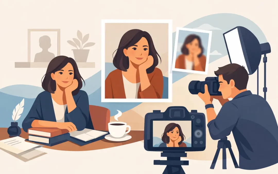
A book jacket may introduce an author through type, color, and a single line of biography. The portrait has a more difficult assignment: it must make the person behind the work feel present. Portrait photography for authors is not simply a polished headshot. It is an editorial image that carries into a jacket flap, festival program, magazine profile, publisher announcement, and the accumulated visual record of a career.
For a publicist, editor, or creative director, the strongest portrait answers a practical question without looking calculated: does this image give people a reason to pay attention? For the author, it should feel accurate enough to live with for years.
A Portrait Is Part of the Author’s Public Text
Readers meet writers in many ways. A name on a spine. A clipped quote. A podcast voice. A social post shared out of context. Photography gives that encounter a face, but it should not reduce a complex body of work to a friendly expression against a blank wall.
The most useful author portrait suggests a point of view. That may come through restraint, a particular use of light, an environment with real emotional texture, or a composition that leaves room for the subject to remain slightly unreadable. The goal is not to illustrate the book literally. A novelist does not need to pose beside a typewriter, and an essayist does not need a shelf of books behind them. Such choices can quickly turn a portrait into a genre cue.
Instead, the image can hold a productive tension between accessibility and mystery. Readers want to recognize the person. Editors want an image that feels considered. The author should still appear to own their face.
Portrait Photography for Authors Starts Before the Shoot
A successful commission is often decided in the conversation before a camera appears. The visual needs of a debut novelist on a tightly timed publicity cycle differ from those of an established writer updating a press archive. An author with a new collection of intimate essays may require a different visual register than a historian, critic, poet, or screenwriter.
Before selecting a location or building a shot list, clarify where the photographs will live. Is the primary use a publisher’s press kit? A feature story? An announcement tied to a release date? An author website, speaking circuit, or a campaign with both print and digital placements? These uses affect orientation, negative space, crop options, and how much visual variation is needed.
A few details matter disproportionately: the tone of the new work, the existing cover design, the author’s comfort in front of the camera, and whether the portrait must feel continuous with prior imagery or establish a new chapter. The best creative direction is specific without becoming restrictive. It gives the photographer a frame, then makes room for observation.
The Right Setting Has a Job to Do
Location is not decoration. It changes posture, gesture, light, and the degree of formality an image communicates. A quiet interior may create concentration. A city street can introduce movement and public energy. A studio can remove distraction and place attention entirely on the author. None is inherently more literary than another.
The question is whether the setting contributes something that cannot be achieved against a neutral background. An artist’s working space can be meaningful if it reveals atmosphere rather than visual clutter. A home can work if it feels like an extension of the subject, not a staged imitation of domestic life. Outdoor portraits can offer a looseness that is useful for writers whose work is restless, expansive, or socially engaged.
There are trade-offs. Environmental portraits tend to be memorable but may be harder to crop for jacket use or narrow press templates. Studio portraits are highly adaptable and often age well, but they demand a more exact relationship between subject, light, and expression. A thoughtful commission often includes both: a clean, flexible portrait for broad media use and a more expansive image with editorial character.
Direction Should Create Space, Not a Performance
Many writers are accustomed to being observed through their work rather than directly. A camera can make that distinction suddenly uncomfortable. The task is not to coax an author into performing confidence. It is to establish enough trust that a more natural presence can emerge.
Good direction is usually quiet. Small adjustments to where someone stands, how they turn toward light, or where they rest their hands can change an image without making it feel overmanaged. Conversation matters. So does allowing time between frames, especially when the subject arrives from a day of interviews, travel, or deadlines.
The most convincing expressions are rarely the largest smiles or the most severe poses. They are often transitional moments: attention settling, a glance returning to camera, a brief thought passing across the face. This is where a portrait moves beyond likeness. It begins to suggest interior life without pretending to explain it.
Style Should Serve the Work, Not Chase a Moment
Visual trends move quickly through publishing and culture. A particular flash treatment, grain structure, or hyper-saturated palette can make an image feel current, but it can also date a portrait before a book has found its readership. That does not mean every author needs a timeless black-and-white studio image. It means the stylistic choice should have a reason.
A more stylized approach may be right for a writer whose public work already operates through performance, fashion, or a deliberately constructed persona. A restrained portrait may better suit a serious nonfiction release, an academic public intellectual, or an author whose writing asks for close attention rather than spectacle. The visual language should be legible to the intended audience while remaining faithful to the subject.
Wardrobe follows the same principle. Clothing should support shape, color, and mood without becoming the story. Solid colors and considered texture usually reproduce well across print and digital formats. Excessively literal styling can narrow the life of the image. The reader should see an author, not a costume designed to signal “author.”
Build a Useful Edit, Not an Endless Archive
The value of a portrait session is not measured by the number of files delivered. A focused edit gives a publicity team assets they can use decisively. It should include variation in framing, orientation, expression, and context, while still feeling like one visual world.
A close portrait may be essential for a contributor page or speaker bio. A horizontal frame can accommodate headline placement in editorial design. A vertical composition may suit a book-related announcement or social campaign. A wider environmental image can give a magazine or cultural publication the space to build a story around the subject.
Consistency matters as much as variety. When images from the same session pull in too many directions, they can make the author’s public identity feel improvised. A disciplined selection is more valuable than dozens of near-duplicates. It respects the author, makes the editor’s job easier, and strengthens recognition over time.
The Image Has a Longer Life Than the Release Cycle
An author portrait may be commissioned for one launch, yet it often outlasts the publicity plan. It is reused for reissues, awards pages, institutional appearances, festival materials, interviews, foreign editions, and retrospective profiles. That longevity is a reason to think beyond the immediate campaign.
The portrait should feel tied to the present work without being trapped by it. A photograph made with care can mark a period in an author’s life and remain useful years later because it does not depend on a short-lived concept. It has clarity, mood, and enough room for the subject to change in the reader’s imagination.
For authors whose work asks readers to spend hours inside a voice, the public image deserves similar attention. Make the portrait specific. Give it atmosphere. Then leave enough unsaid for the writing to do the rest.