
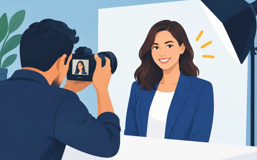
A publicity image is often seen before the work it represents. It may introduce a filmmaker to a festival programmer, an author to a culture editor, a founder to a reporter, or an artist to an audience that has no context yet. The strongest publicity photo guidelines begin there: the photograph must create immediate recognition while leaving enough room for the subject to remain interesting.
A usable press portrait is not simply a flattering headshot. It is a considered asset with a job to do. It needs to reproduce well at different sizes, fit an editorial layout without friction, and feel specific enough that it cannot be mistaken for generic promotional material. The challenge is to make those practical requirements serve the image rather than flatten it.
Start With the Actual Editorial Use
Before a photographer, publicist, or creative director discusses location, ask where the images will appear. A book announcement, a magazine profile, a film release, a gallery exhibition, and a brand partnership all ask different things of a portrait.
For a press release, an editor may need one clear, current image that can sit beside a headline at a small size. For a feature, a publication may need horizontal and vertical compositions, a range of expressions, and room for typography. A campaign may require a more controlled visual world, with consistent color, styling, and sets of crops for social, digital advertising, and print.
This is where many shoots lose value. A single beautiful frame can be enough for a tightly defined announcement, but it rarely covers an entire publicity cycle. Plan for the lead image, then make room for supporting images that remain part of the same visual language.
Publicity Photo Guidelines for a Strong Edit
The best deliverables are edited, not exhaustive. Sending hundreds of near-identical files asks a busy editor to make decisions that should have been made before delivery. A focused selection signals judgment and makes the work easier to place.
A practical final set usually includes a recognizable primary portrait, a few alternate expressions or angles, horizontal and vertical options, and both close and environmental frames. The exact number depends on the assignment. A debut novelist may only need a concise set; a public figure with a year of announcements ahead may need more range.
Each frame should earn its place. The subject’s expression, posture, and placement in the composition should change enough to create a real option. A variation in which only the blink differs is not an option. It is an editing problem.
Leave Room for the Layout
Editors value negative space because headlines, captions, pull quotes, and mastheads need somewhere to go. That does not mean every portrait should place the subject mechanically on one side of the frame. It means the composition should anticipate use.
Photographing with a little breathing room around the subject protects the image from aggressive cropping. Capture both orientations when time allows. A vertical portrait may lead a print feature, while a horizontal frame can become the preferred choice for a website banner or event listing.
Avoid delivering images that only work at one narrow crop. If the subject’s face is pressed against the top edge, or essential details disappear as soon as an editor trims the frame, the photo becomes harder to use regardless of its visual appeal.
Make the Subject Legible, Not Overexplained
Publicity photography should reveal something true about the person or project without illustrating a résumé. A musician does not need a guitar in every frame. A chef does not always need a kitchen. Those choices can be useful, but they should be intentional rather than automatic.
Wardrobe, setting, gesture, and light can establish tone with more sophistication than literal props. A sharply tailored portrait might support a formal profile; an unguarded image in a lived-in space might better suit an artist’s studio visit. The right direction depends on the desired public identity and the publication’s visual culture.
Polish matters, but excessive retouching has a cost. Skin that no longer carries texture, eyes overly brightened, or features reshaped beyond recognition can undermine credibility. Retouch for distraction, consistency, and print readiness. Preserve the person.
Build a Shoot Around Trust
The most useful publicity photographs often appear effortless because the preparation was precise. Talent should know the purpose of the session, the expected duration, the wardrobe direction, and whether the final image needs to feel formal, intimate, energetic, or spare. Clear expectations free the subject to be present.
A shot list can help, provided it is not treated as a script. Use it to protect the necessary frames: the clean portrait, the alternate orientation, the detail, the environmental image. Then leave room for the photograph that happens when the subject relaxes, the light shifts, or a particular gesture changes the atmosphere of the frame.
For publicists and representatives, the most productive role on set is often to establish priorities early and allow the session to proceed without constant intervention. Approval concerns are legitimate, especially when an image will represent a client widely. Yet a portrait becomes stiff when every expression is measured against a narrow expectation in real time. Agree on the boundaries, review selectively, and let the photographer work within them.
Technical Standards Are Part of the Aesthetic
A compelling image that arrives in the wrong format creates unnecessary delays. Final files should be high resolution, professionally color-corrected, and named clearly. Include the subject name and relevant date or project identifier in the filename so an editor can locate the right asset quickly months later.
For most publicity use, provide high-resolution JPEGs in an appropriate color space, with separate web-ready versions when requested. Keep the original high-resolution files available. Do not rely on a compressed image pulled from social media as the master press asset. It will fail quickly in print and may look brittle on larger screens.
Caption information is equally useful. At minimum, identify the subject, photographer credit, and any required usage language. If the image has an embargo, restricted territory, or a specific approval condition, state that plainly before distribution. Ambiguity around rights can keep an otherwise excellent photograph out of publication.
Credit should also be easy to find. A clear credit line respects the image maker and prevents editorial teams from having to chase basic information under deadline.
Keep the Visual Identity Current
Publicity images age faster than people expect. Hairstyles change, careers shift, visual identities evolve, and old files continue circulating long after they no longer represent the subject. A current portrait does not have to be taken every month, but it should correspond to the work being introduced.
Update imagery at meaningful transitions: a new book, a major role, a new collection, an exhibition, a leadership change, or a shift in brand direction. Maintaining a small, current library is more valuable than relying on one heavily used image for years.
Consistency matters when several people or projects belong to the same campaign. This does not require identical backgrounds and poses. It means the images share an intelligible point of view. Similar lighting quality, tonal restraint, or art direction can make a press kit feel coherent while allowing each subject to retain individuality.
Know When Restraint Is the Better Choice
Not every publicity assignment needs a large production. A lavish set, extensive styling, and elaborate concept can be right for a cover story or campaign launch. They can also overwhelm a modest announcement or make a subject appear less accessible than intended.
The useful question is not whether the image looks expensive. It is whether the visual treatment fits the scale, audience, and ambition of the work. A precise portrait in natural light may carry more authority than a crowded production with no clear reason for its choices.
That restraint is especially valuable when the subject already has cultural recognition. The photograph does not need to announce importance. It needs to give editors an image they want to run.
A publicity portrait succeeds when it holds its own in a crowded media environment and still feels like a person, not a package. Give the image a clear purpose, give the editor real options, and leave enough space for the subject to remain memorable.